

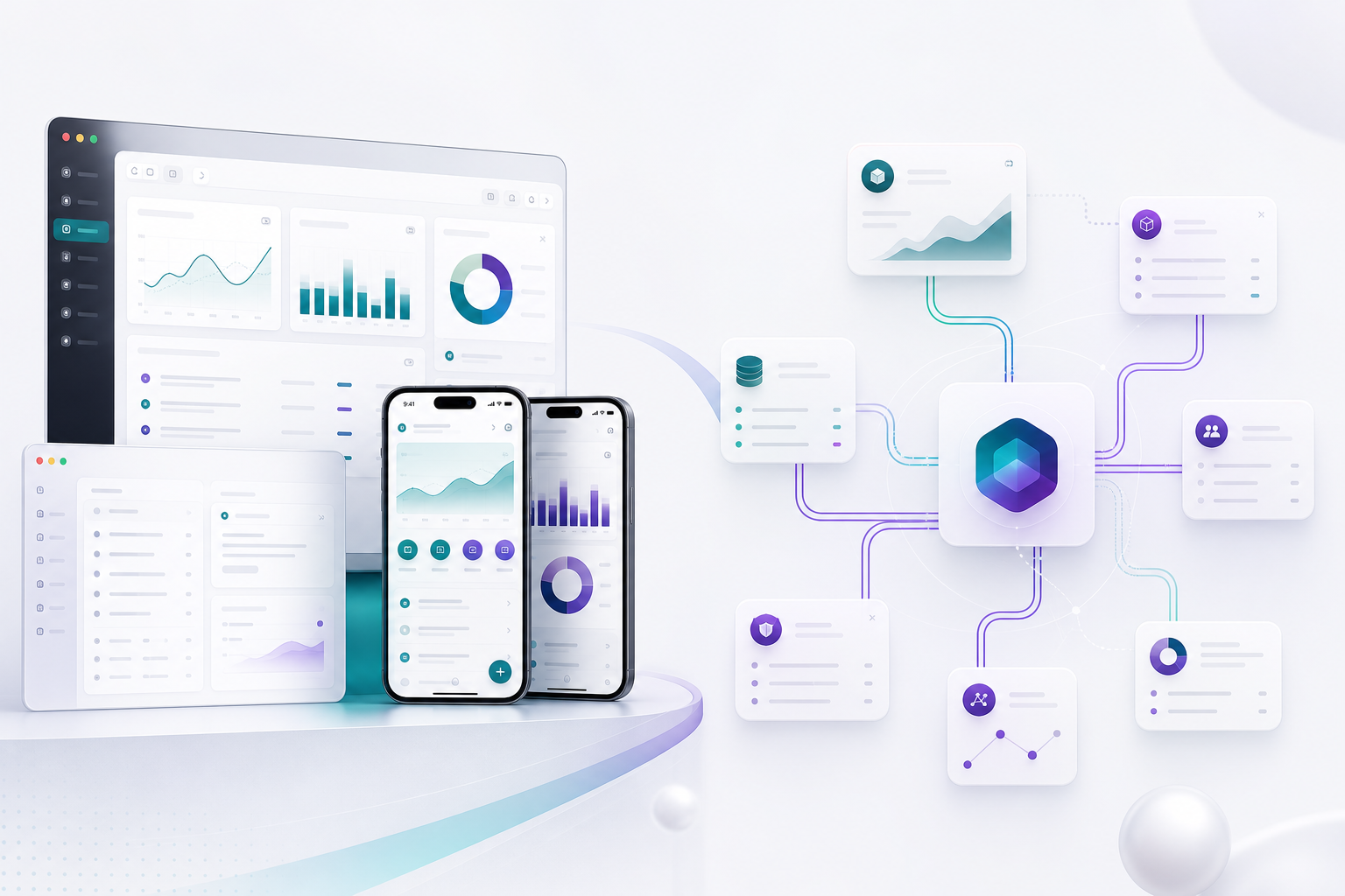
A holding company for software that ships.
NodeDa owns Nrova as a wholly owned subsidiary and holds a stake in Kinlily. We back companies that build products people trust, and stay close to the craft.
Own what matters. Back what lasts.
Holding company. Operator mindset.
NodeDa, LLC is a holding company. We own Nrova outright and hold equity in Kinlily. Through our subsidiary and investments, we stay close to product execution: clear scope, real accountability, and outcomes you can measure.


Wholly owned. Built to run the business.
Nrova is a wholly owned subsidiary of NodeDa. Planning, UX continuity, CRM, docs, and IT in one suite: the operator platform our companies run on every day.
Open Nrova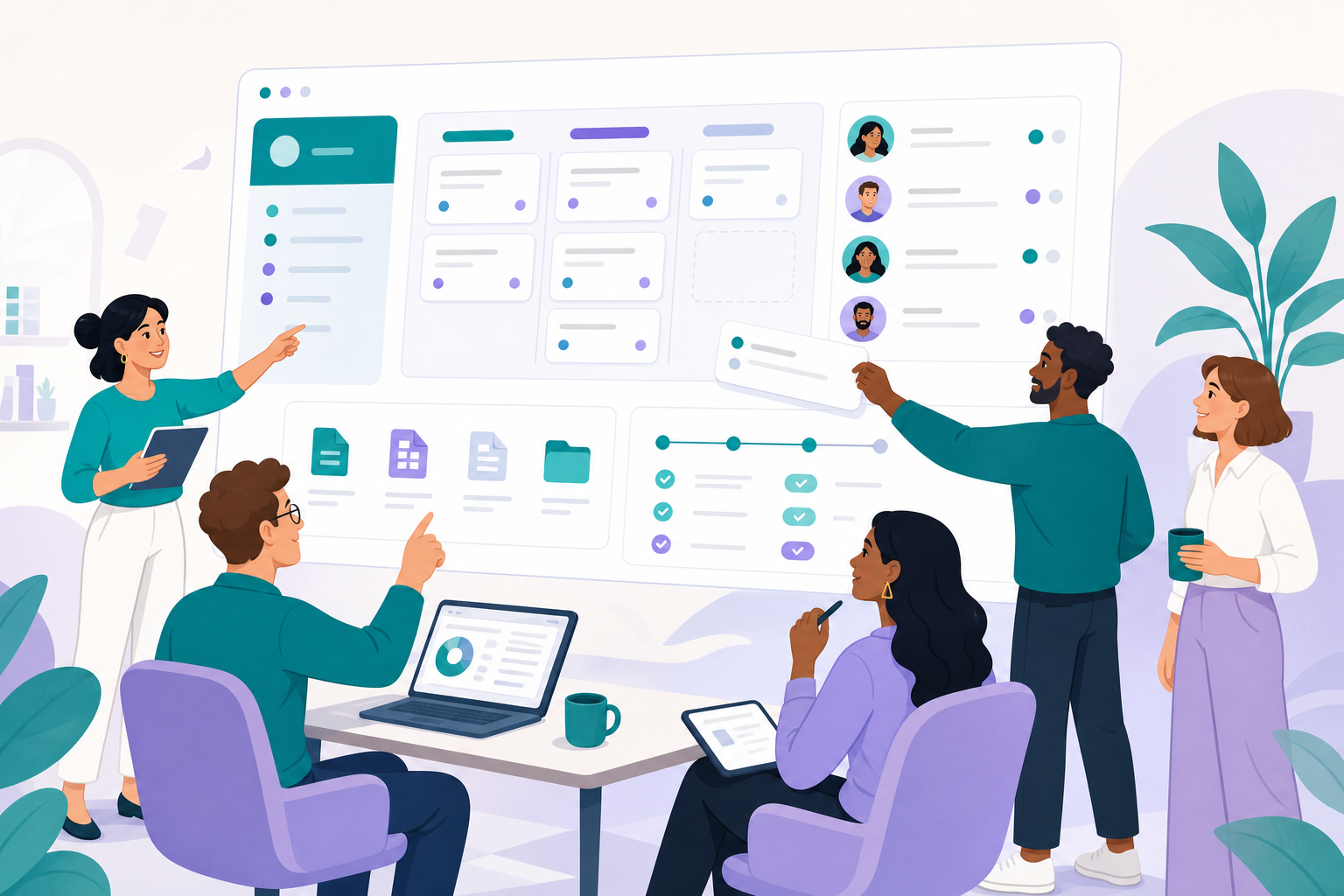


Design that ships with the product.
A Nrova product for design and creative teams who need to move from concept to polished surfaces without losing the plot.
Open Studio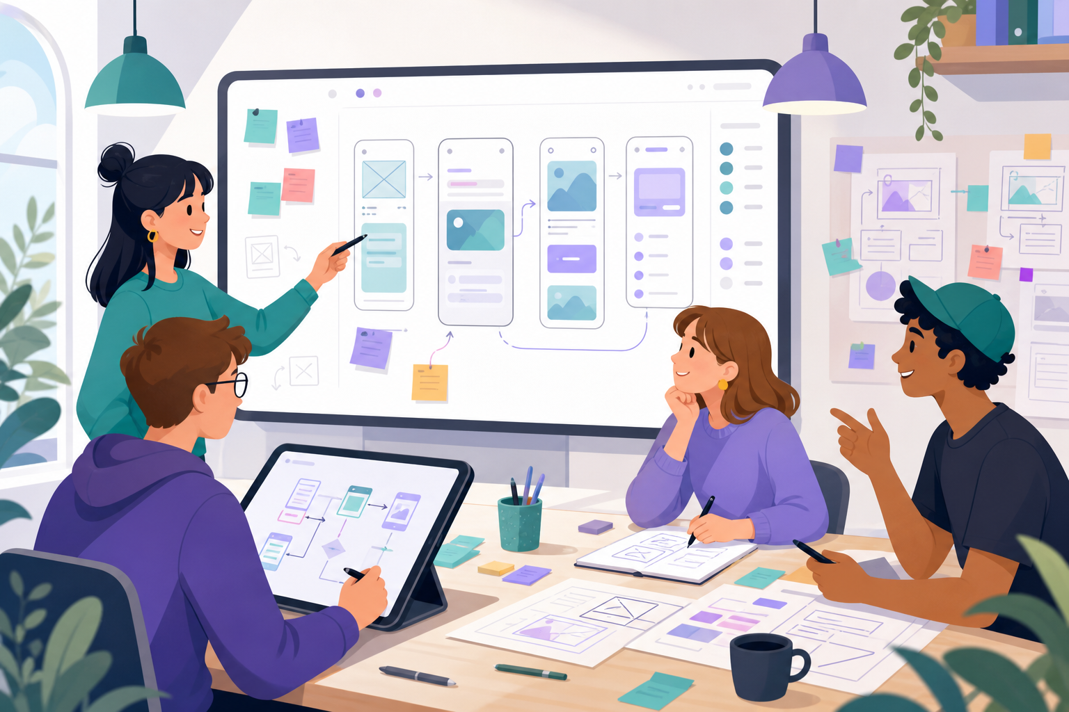


Extend Nrova with AI-friendly APIs.
A Nrova product for builders. Connect with the tools behind the suite and shape customized experiences with very little coding.
Open Developer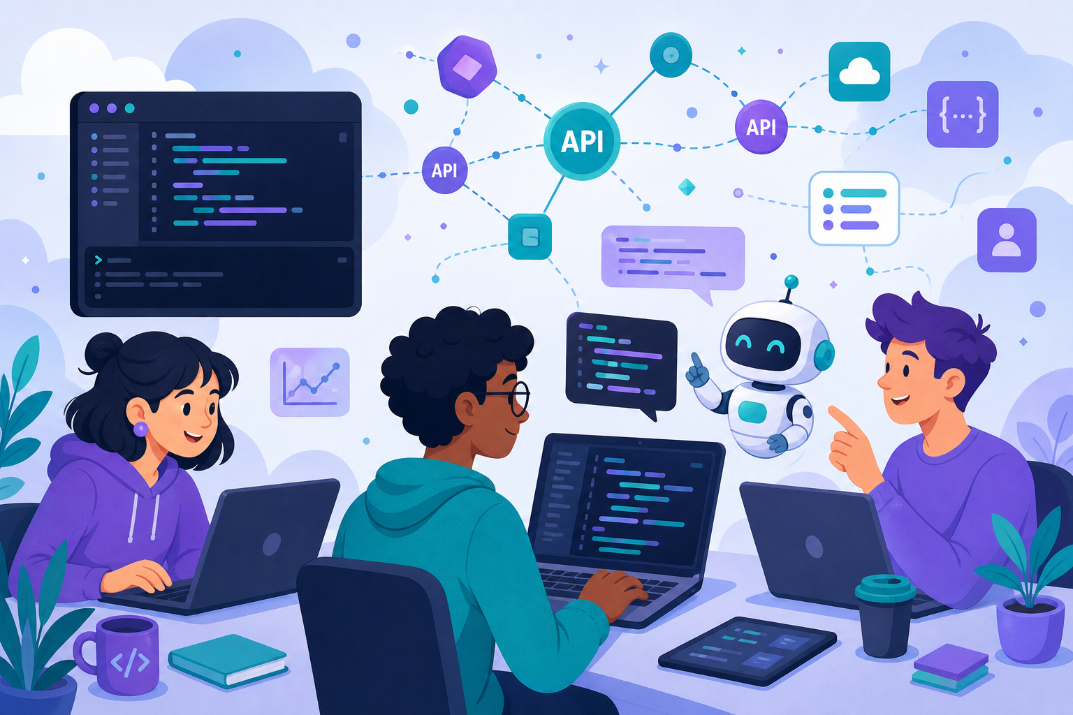


An equity stake, not a NodeDa product.
NodeDa holds a stake in Kinlily, Inc. Kinlily runs the Cookbook ecosystem under its own brand at kinlily.com. Separate company. Separate product. Shared ownership.
Visit Kinlily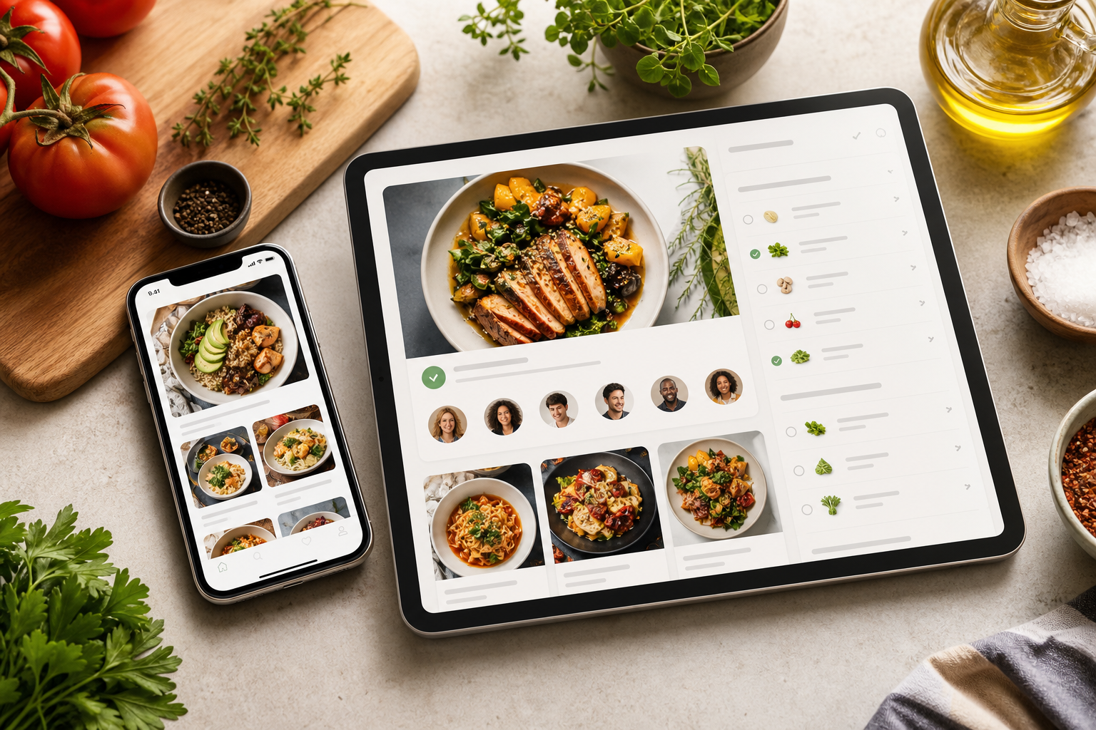
How work moves from ambiguity to release.
Four phases. One loop. Strategy and execution stay connected so the product that ships matches the product that was promised.
Understand the system
Users, constraints, revenue motion, and technical reality, before a single screen is drawn.
Decide what matters
We cut scope to the work that moves adoption and revenue. Clarity beats volume.
Design & build together
UX, engineering, and product stay in one loop so handoffs do not become the product.
Ship and prove it
Releases, instrumentation, and iteration until the outcome is visible, not just delivered.
What we refuse to compromise.
Jakob Nielsen's ten usability heuristics. The craft bar we hold on every surface we design.
Visibility of system status
Users always know where they are and what the system is doing, through timely, clear feedback.
Match between system and the real world
Language, concepts, and flows follow how people already think, not how engineers name things.
User control and freedom
Easy exits, undo, and redo. People should never feel trapped by a path they did not mean to take.
Consistency and standards
Same words, patterns, and behaviors across the product, and alignment with platform conventions.
Error prevention
Better than good error messages: designs that stop mistakes before they happen.
Recognition rather than recall
Options, actions, and information stay visible or easy to retrieve; memory is not the UI.
Flexibility and efficiency of use
Shortcuts and accelerators for experts, without making the product harder for newcomers.
Aesthetic and minimalist design
Every element earns its place. Irrelevant information competes with what matters.
Help users recognize, diagnose, and recover from errors
Plain language, precise problems, and constructive next steps, not cryptic codes.
Help and documentation
When help is needed, it is searchable, task-focused, and concrete, not a wall of prose.
See what our companies ship.
Native apps from our downloads page, plus Nrova's suite: Admin, Studio, and Developer.
Services